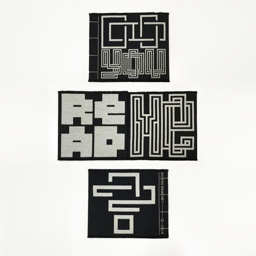
DO YOU READ ME? Playing on the duality of reading as both a means of deciphering the medium of a message and comprehending its meaning, this is the title of Emigre Magazine No. 15, which posed questions about legibility. ChatGPT: Typically used in radio communication to ask if the recipient is able to hear and understand the message being transmitted, this phrase is a way to check the clarity and strength of the communication link and ensure that the message has been successfully received and comprehended. In a broader context, it is used metaphorically to ask if someone understands or comprehends what you are saying or conveying. 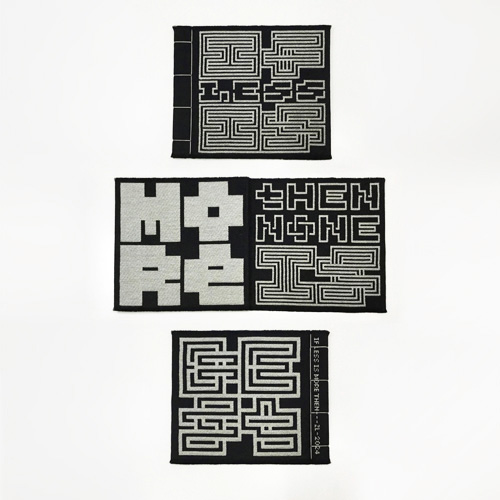
IF LESS IS MORE, THEN NONE IS BEST Testing the premise: "Less is More" from Mies van der Rohe. Imagine taking it to the extreme, revealing the importance of striking a balance, and that sometimes doing nothing may be best. ChatGPT: Taking "Less is More" to the extreme of "None is Best" may not always be ideal. While simplicity has its advantages, complete absence can lead to impracticality or lack of functionality. It's often about finding the right balance between simplicity and necessity. 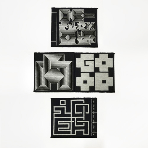
DESIGN IS A GOOD IDEA Playing on the duality of design as both an action and a concept. Thereby, it's a Good Idea to employ the process of design, as well as a Good Idea being the necessary kernel of a design. ChatGPT: While design can be a powerful and beneficial force in many contexts, it's crucial to approach it thoughtfully and responsibly. The double meaning of "Design is a Good Idea" arises from the ambiguity of the word "idea" and the duality of "design" as both a noun and a verb. 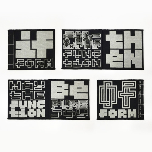
IF FORM FOLLOWS FUNCTION, THEN MAY THE FUNCTION BE PURE JOY OF FORM Consider beauty as the function of form. Whereas Louis Sullivan's "Form Follows Function" maxim is often interpreted to simplify a form to its mechanical function, the pleasure derived from the beauty of form can be an equally important function. ChatGPT: The principle "form follows function" suggests that the design and appearance of an object should be primarily determined by its intended purpose or function. In other words, the form or shape of something should be dictated by its practical use or utility. This principle is often associated with modernist design and architecture. 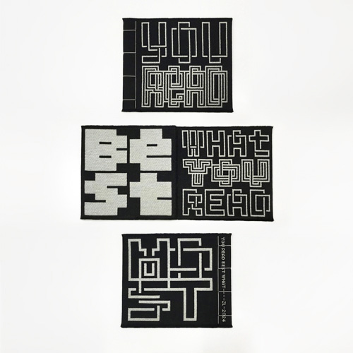
YOU READ BEST WHAT YOU READ MOST Your familiarity with a typeface improves its legibility. This adage was deduced (by me) from the writings of Herbert Spencer, based on various legibility studies. It's eye opening to realize that blackletter was at one time considered more legible than the humanist designs of today. ChatGPT: Readers may find it easier to read text written in fonts they are familiar with or have seen frequently. Familiarity with a particular font can enhance readability and comprehension. 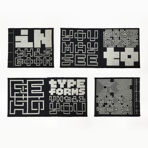
IN THIS BOOK YOU MAY SEE SOME HARD TO READ TYPE FORMS, UNTIL YOU DECODE THEM Reading develops your ability to decipher systems of alphabetic symbols. Repeated exposure to the unfamiliar makes it commonplace. ChatGPT: Letter recognition in reading is a complex process that involves visual feature detection, pattern recognition, learned associations, contextual cues, and efficient cognitive mechanisms. Through repeated practice and exposure, individuals develop automaticity in recognizing letters and words, facilitating fluent and effective reading. 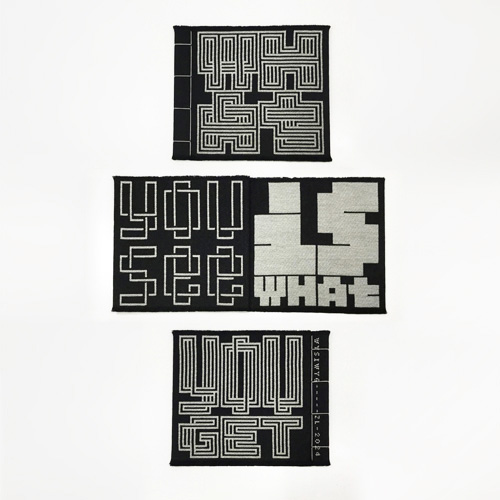
WHAT YOU SEE IS WHAT YOU GET This catchphrase, from 1970s and 80s popular culture, inspired the acronym WYSIWYG, for software that displays text in formatted preview. ChatGPT: WYSIWYG editors make it easier for people who are not familiar with coding to create visually appealing documents and web pages. This approach contrasts with markup languages like HTML, where the code and the final rendered web page might look very different. 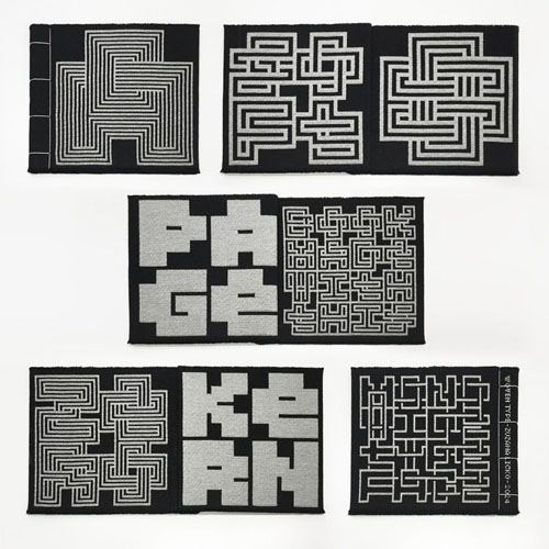
A SOFT 8 PAGE BOOK MADE WITH THIS ZERO KERN MONO WIDE TYPEFACE Being the first book in this series, the text is self-referential, and invites you to see both patterns and words. The text in this one is strictly limited to words of one and four letters, and panels of only one or four words. The format of texts in folios that followed became more flexible, as I expanded the font variants to accomodate more layout options. |